

Style your surveys and messages with themes
Create themes with your brand color, font and corners, adjust each channel, add dark colors, check the contrast, and choose which theme each survey uses.
A theme holds the look of your surveys and messages: colors, fonts, corners, borders and shadows. You set your brand once, adjust each channel where it needs it, and every survey that uses the theme follows.
Before you start
Section titled “Before you start”- The theme editor is in beta. A workspace admin turns it on with New theme editor in Beta features, and your widget keeps its current look (see Try beta features).
- You need the right to edit the workspace settings.
- Every plan sets its brand in themes. Designing every detail needs a plan with advanced customization: see what each plan includes below.
What your plan includes
Section titled “What your plan includes”Every plan can set its brand:
- the brand basics: your brand color, one of Screeb’s fonts and the corners;
- every field that follows the brand, as long as it follows it: the buttons, the links, the selected answers, the focus ring, the fonts, the corners and the launcher’s corners;
- the text on the buttons and the selected answers, whatever its value;
- the card background and its text, on every layer (except the bot bubbles of conversational surveys);
- the reply bubble of conversational surveys and its text;
- the launcher colors;
- the layers of a theme, and the theme a channel, a distribution or a message uses;
- up to 3 themes.
A plan with advanced customization designs every detail:
- a value of its own on a field that follows the brand, such as orange buttons on a green brand or another title font;
- every other field: header colors, borders, shadows, the secondary and field colors, sizes;
- uploaded fonts;
- dark mode;
- a theme of its own for a step of a message;
- as many themes as you need.
On other plans, a field that needs advanced customization shows a crown next to the field name, named Paid plan. Click it to try the value in the preview with Try it in preview, without saving it, or to upgrade with Upgrade. Dark mode, uploaded fonts and more themes have no preview: each shows how to upgrade where you use it.
Open your themes
Section titled “Open your themes”- Open the settings and click Themes in the Design group. The list shows each theme, where it is used and when it was last edited. Used in counts the workspace default, the channels, the distributions and the message steps that use the theme.
- Click New theme to start a theme from the Screeb default, or click a theme’s name to edit it. The theme marked Default is the one your workspace uses.
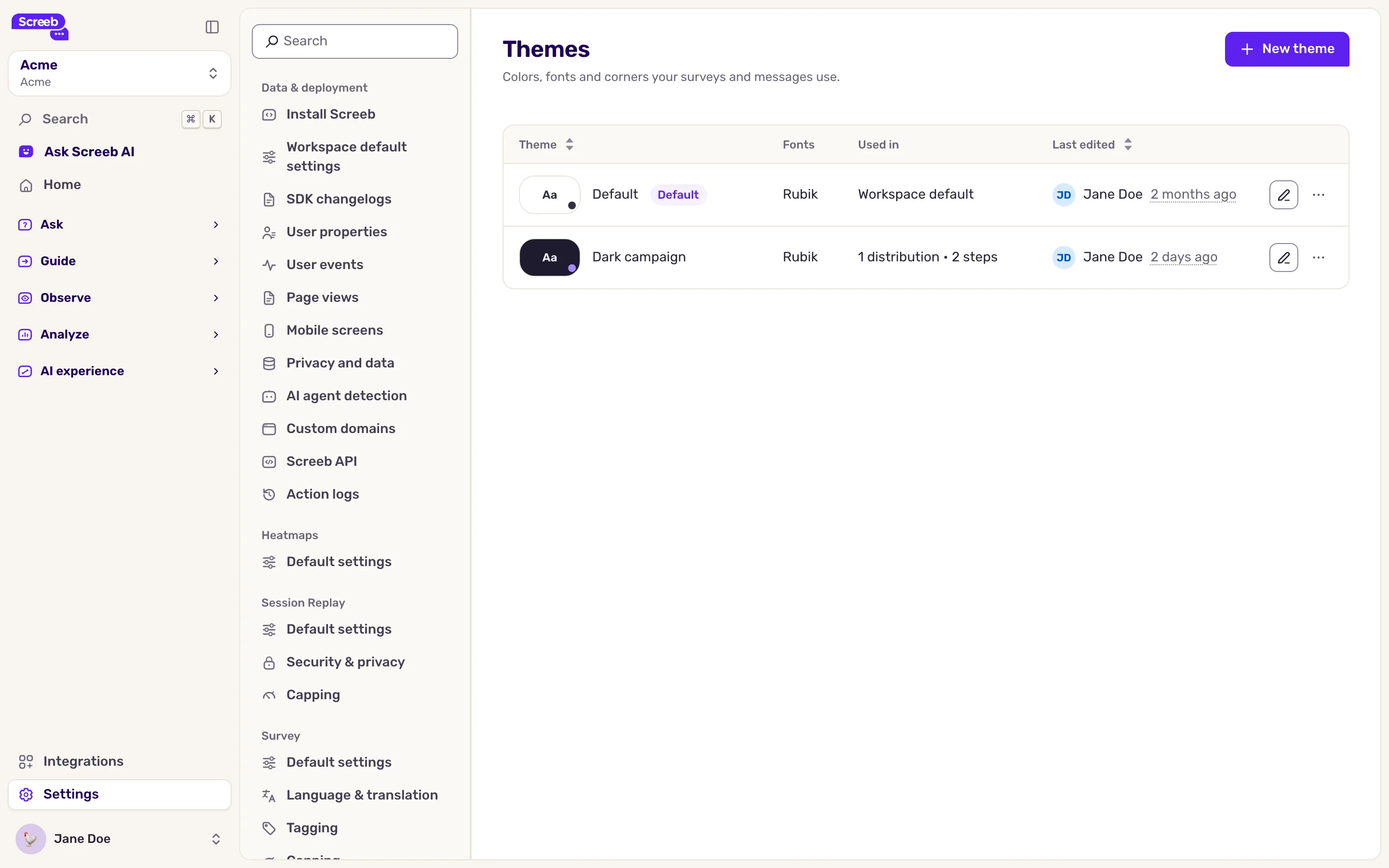
The menu at the end of a row offers Duplicate and, on any theme but the default, Set as workspace default. A new default applies to every survey and message that does not pick its own theme. Copy to another workspace shows when another of your workspaces uses themes too.
Without advanced customization, a workspace can have up to 3 themes. With 3, New theme and Duplicate turn off, and the page shows: Free plans can have up to 3 themes. Delete themes to get below 3, or upgrade to add more. Copying a theme with Copy to another workspace also refuses a workspace that already has 3. The themes Screeb made from your design settings when it turned themes on are all kept, even past 3: you can still edit them, delete them, make one the default and pick them for a channel. Delete themes until you have fewer than 3 to create one again, or upgrade.
Set your brand
Section titled “Set your brand”- In the editor, select Base in Layers, on the left.
- In Brand basics, pick your brand color, your font and the Corners. Every plan can pick one of Screeb’s fonts. The buttons, the selected answers, the links and the focus ring follow the brand color, and the preview on the right updates as you go.
- To use your own font, click Manage fonts and drop its woff2 files. The files of one font make one family, named after the files, which you can rename before uploading. Surveys only use the regular (400) and bold (700) styles, so the panel keeps those two files and lists the others, such as other weights and italics, under Some files will not be uploaded: they are not uploaded. When no file is regular, the one nearest to it stands in. The font becomes available in every theme of the workspace. The panel lists each font of the workspace as a card with its regular and bold files. Add bold (or Add regular) uploads the missing file into that font. Uploading a style a font already has replaces the stored file, after you confirm. Files of other styles uploaded earlier show under Other files (not used), each with its delete button, and the card’s menu deletes the whole family with Delete the family. Uploading fonts needs advanced customization: on other plans, the panel shows Upload your own fonts with advanced customization.
- Click Save.
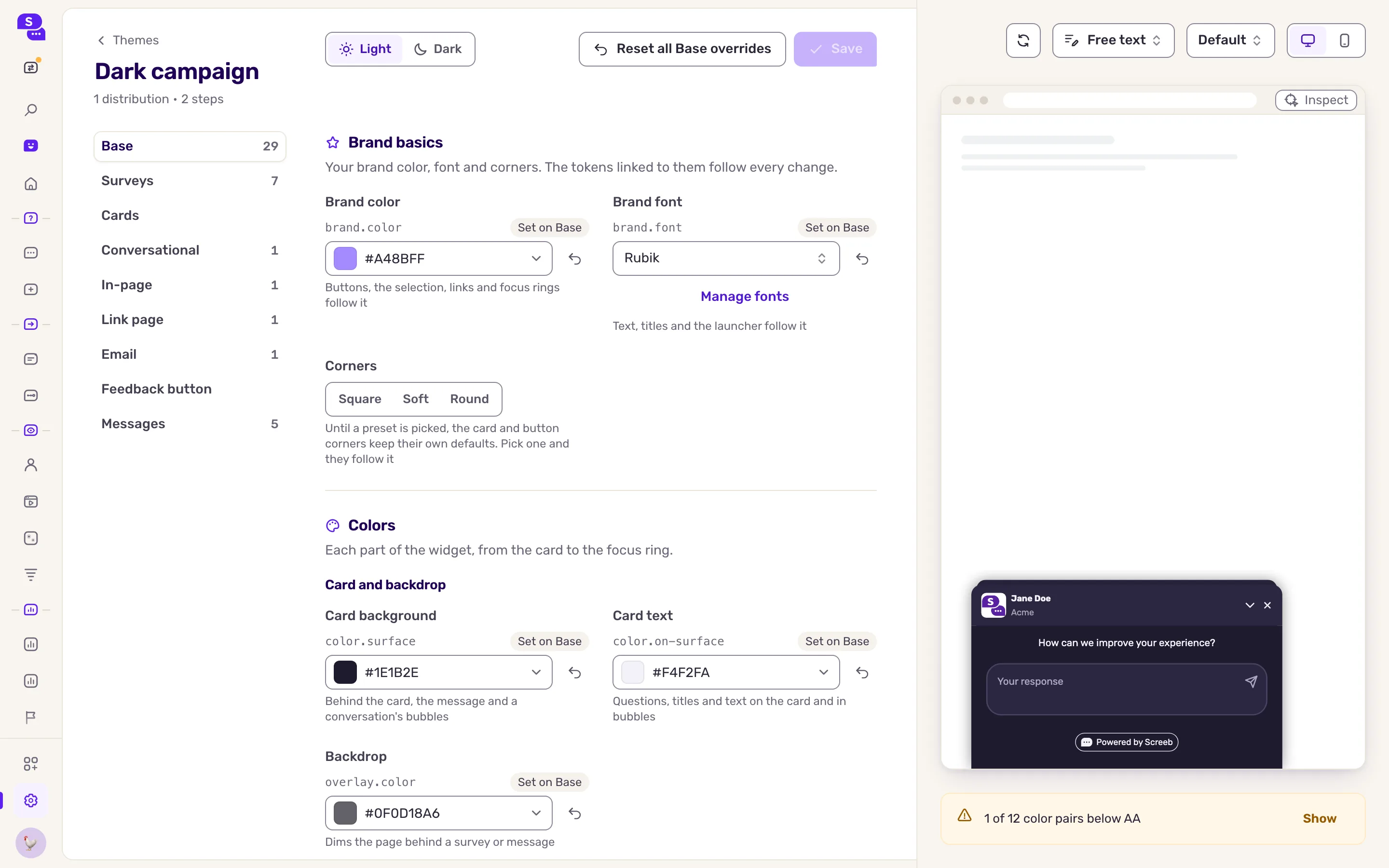
A brand basic you leave Not set has no value of its own: the colors, fonts and corners it would drive keep Screeb’s defaults until you set it.
A field that follows another value shows that value with a chip naming the field it follows, such as your brand color: click the chip to go to that field. To give the field a value of its own, click the unlink icon at the end of the field: it keeps its current value and stops following. On a plan without advanced customization, a field that follows your brand has no unlink icon: its crown offers to try a value of its own.
Adjust a channel
Section titled “Adjust a channel”Each layer under Base styles one kind of survey or message, such as Surveys, Messages or Email. A layer inherits every value from the layers above it: set a value only where a channel must look different. The rail shows how many values each layer overrides, and each field tells you where its value comes from, with a way to reset it.
Check the contrast
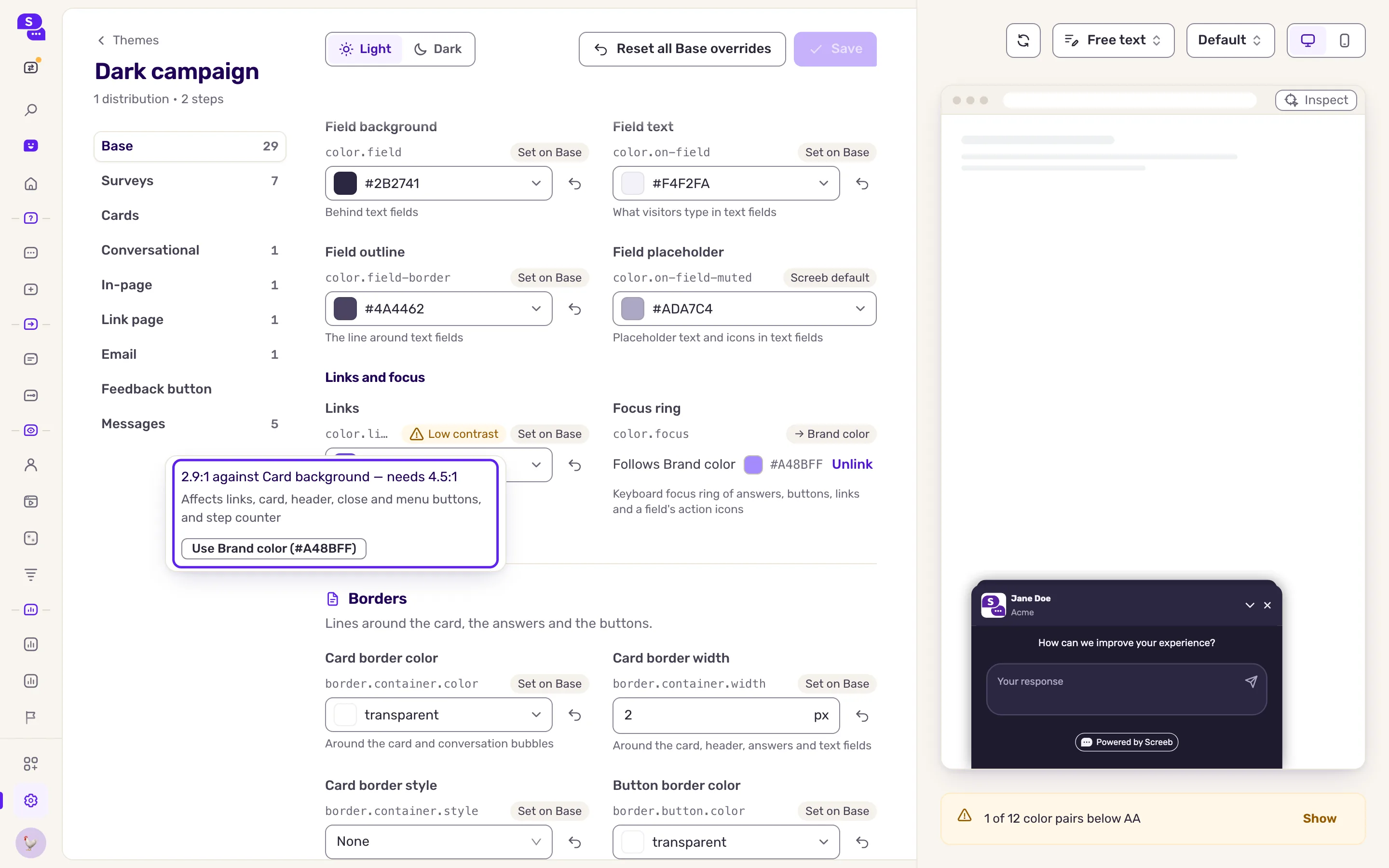
Section titled “Check the contrast”Screeb compares every text color with the background it sits on, and the buttons and the selection with what surrounds them. Text needs a contrast ratio of 4.5:1 (WCAG AA), the buttons and the selection 3:1. When a pair is below its ratio, the field shows Low contrast, and the top of the form counts the pairs to fix, with Show to jump to the first one.
- Click Low contrast. The details give the ratio, the ratio needed and the parts of the widget it affects.
- Click one of the suggested fixes: another color of your theme, a darker or lighter text, or a darker or lighter background. A fix never breaks a pair that passes today, on the layer you edit or on the layers that inherit from it.
- Click Save.
Add a dark mode
Section titled “Add a dark mode”A theme without dark colors always looks the same, in light or dark mode. Once it has dark colors, your surveys and messages show them when your site or app is dark.
Dark mode needs a plan with advanced customization. On other plans, a crown next to the Light / Dark switch reads Dark mode needs advanced customization. and shows how to upgrade, and your surveys and messages always stay light, even when a theme has dark colors.
- In the editor, use the Light / Dark switch at the top to switch from Light to Dark. The form now shows and edits the dark values, and the preview shows the dark values (a theme with none stays light in the preview, only the page around it darkens).
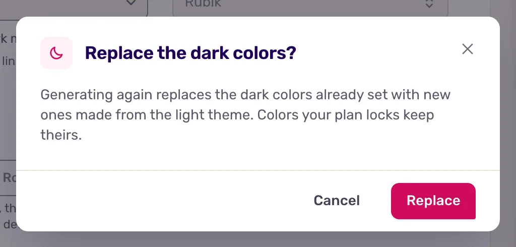
- To start from your light theme, click Generate dark theme, at the end of the line above the colors, which only shows in Dark mode. Screeb writes dark values once, from your light colors: it keeps your brand hue and checks the contrast. If the theme already has dark values, a dialog, Replace the dark colors?, asks you to confirm with Replace.
- Edit any dark color you want to change, then click Save. Generated values are yours: nothing changes them afterwards.
In dark mode, a color that has no dark value yet shows where it comes from: Uses the light value when it keeps its light value, or Screeb dark default when Screeb fills it. That line counts the colors without a dark value (or says every color has one), with Go to the first to jump to the first one. Fonts, corners and sizes, and the brand basics, are the same in light and dark mode: they show as read-only (Same in light and dark mode). The contrast check runs in both modes. While the theme has no dark value at all and message steps use it, a second line in that callout says how many steps stay light in dark mode until you add some.
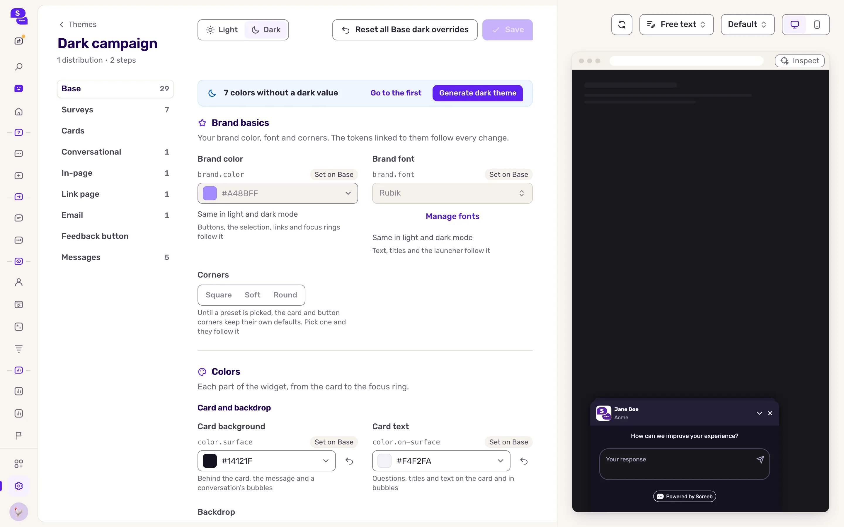
Screeb fills the colors you rarely set, such as fields, dividers, muted text and tooltips. When you leave your brand colors to Screeb, it also uses its own dark button and link colors.
When surveys and messages turn dark
Section titled “When surveys and messages turn dark”How a survey or message decides to turn dark is set where the Screeb tag is installed. In the JS snippet, the Dark mode for surveys and messages choice (Light / Dark / Auto) above the installation steps is Auto by default (see Install Screeb on your website). With Auto, on the web, Screeb follows a dark-mode marker on your page’s <html> element (a dark class, a data-theme attribute and similar), and otherwise the visitor’s device setting. Your developers can force a mode or switch it from code, see Dark mode in the developer docs. In iOS and Android apps, surveys and messages follow the device setting for now; following the app’s own appearance or forcing a mode comes with an SDK update.
- A step with its own theme decides for itself: a step theme without dark values stays light in a dark message.
- Emails stay light. Link pages follow the visitor’s device.
Choose the theme of a survey
Section titled “Choose the theme of a survey”Each channel of a survey uses your workspace default theme. To give one channel another theme, open the design page of that channel, from the survey’s share page, and pick the theme in Theme. The workspace design pages have no theme choice: they always follow the default. Pick Workspace default to follow the default again.
Once themes are on, the design pages of your channels keep their behaviour settings only: format, position, size, sounds, display options, identity, and the background of the link page and of emails. They show Colors, fonts and corners come from your themes. with a Manage themes link to this page. On a channel, Workspace design and Specific design choose where these behaviour settings come from, never the look, and the preview shows the theme the channel uses.
Give a step of a message its own theme
Section titled “Give a step of a message its own theme”A step of an in-app message or a product tour can use another theme than the rest of the message, for example to make a warning step stand out. The step then shows that theme in the message’s format, its backdrop and beacon included; the other steps keep the message theme.
- Open the message in the builder, on your site or in your app, and select the step.
- In the step sidebar, open Theme, in the Display section.
- Pick a theme of your workspace. Message theme, first in the list, makes the step follow its message’s theme again. The preview of the step updates at once.
- Save the message.
Steps get a theme in the builder only, not in the message editor of the admin. On a plan without advanced customization the setting shows locked, and the steps that already have a theme show the message theme until you upgrade.
A step whose theme was deleted shows the message theme.
Delete a theme
Section titled “Delete a theme”- In the menu at the end of the theme’s row, click Delete. A theme nothing uses asks you to confirm with Delete theme.
- When the theme is in use, the dialog lists the distributions and the message steps that use it. Pick where they go: another theme, the workspace default unless you change it, or No theme of its own. With no theme of their own, distributions follow their channel’s theme or the workspace default, and steps their message’s theme.
- Click Move and delete.
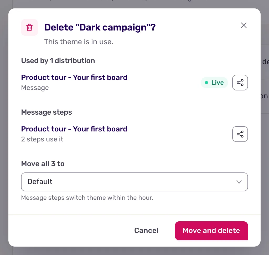
The move applies to every version of the messages, without creating a new one. Message steps switch to their new theme within the hour.
The workspace default and a theme a channel uses cannot be deleted: set another default, or give the channel another theme, first.
What you get
Section titled “What you get”Your surveys and messages show the theme of their channel, or the workspace default, and a message step shows its own theme when it has one. A change you save in a theme reaches every survey that uses it, with no change to the surveys themselves.