

Customize the design of your messages
Set the default look of every in-app message of your workspace, then give one message its own colors, fonts, borders and sender when it needs to stand out.
Make your messages look like your product. You set one default design for all the messages of your workspace, and every message uses it. When one message needs something different, give it a specific design.
Before you start
Section titled “Before you start”- Your role lets you edit messages and the settings of the workspace.
- The pop sound, the sender and the primary colors are always available. Size, borders, buttons, overlay, the other colors, fonts and the avatar format need the advanced customization of your plan: without it, these fields are locked and offer an upgrade.
What the design controls
Section titled “What the design controls”The design sets the look shared by every step of a message: colors, font, borders, buttons, the overlay color and who the message seems to come from. It applies on websites and in iOS, Android, Flutter and React Native apps alike. The format, position and size of each step, and whether it dims the page (“Show overlay” on a Modal, Sidebar or Banner), are set step by step in the editor, see Create an in-app message or product tour.
Set the default design of your messages
Section titled “Set the default design of your messages”- Open the settings and find the In-app messages & product tours group.
- Click Design settings. The Message design settings page opens, with a live preview on the right that updates as you change a setting.
- Adjust the settings, described below.
- Click Save at the top right.
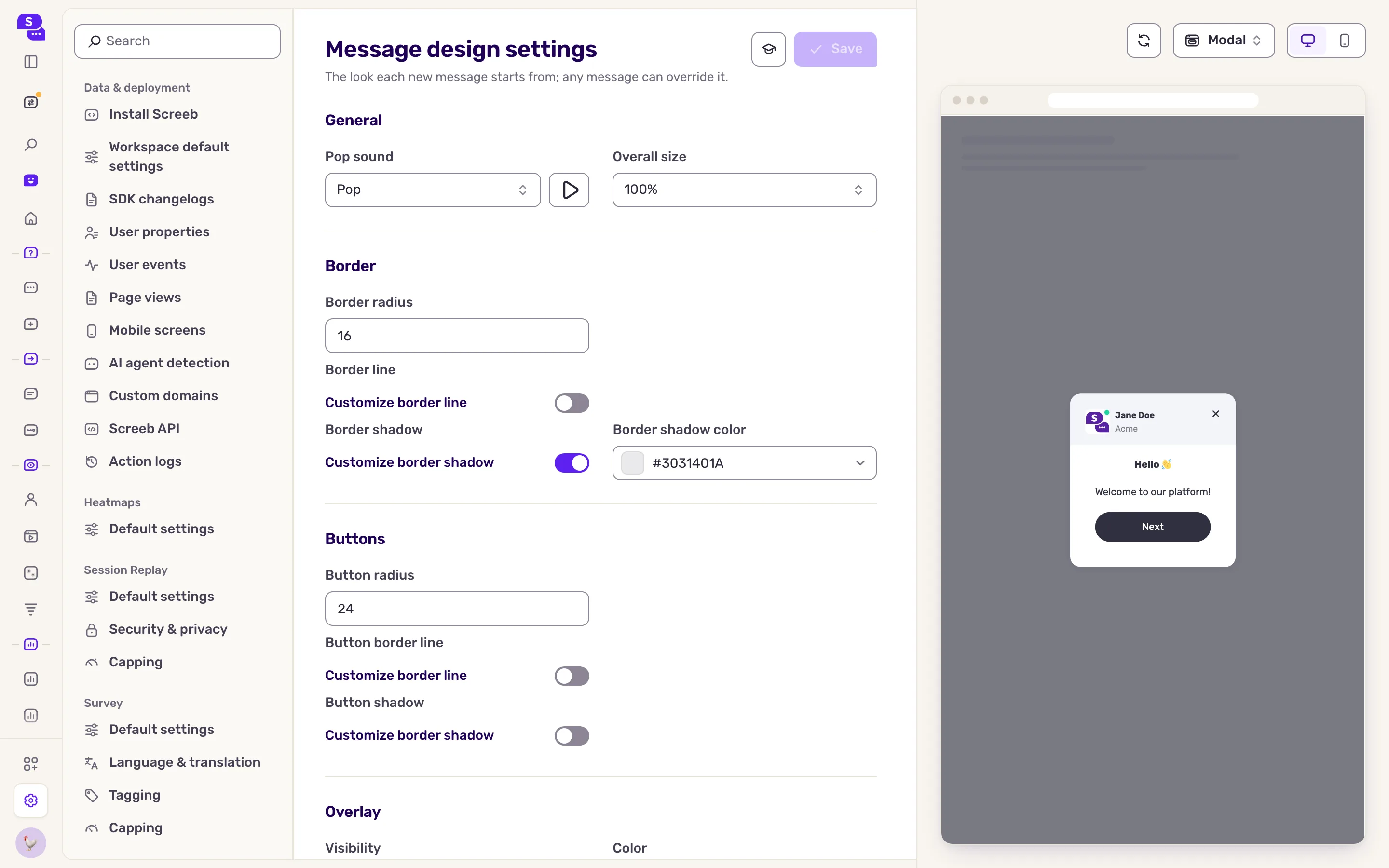
| Section | What you set |
|---|---|
| General | Pop sound played when the message shows, and Overall size. |
| Border | Radius, border line and shadow of the message. |
| Buttons | Radius, border line and shadow of its buttons. |
| Overlay | The color of the overlay that dims the page behind a step. Its Visibility setting does not apply to messages. |
| Display name, avatar and title | Under From, who the message seems to come from: a person with an avatar, a name and a title, or Screeby, shown as an avatar only. It shows in the Header block of a step. |
| Colors | Primary, secondary and tertiary colors, each with its text color. |
| Font | Font family and size of titles and texts, weight of titles, line height of texts. |
Give one message its own design
Section titled “Give one message its own design”- Open the message and click Design & targeting at the top.
- In the side menu, click Design.
- Under Design source, switch from Workspace design to Specific design. The settings appear, prefilled with the workspace design.
- Change what you need. The undo arrow next to a changed field puts back the workspace value.
- Click Save at the top right.
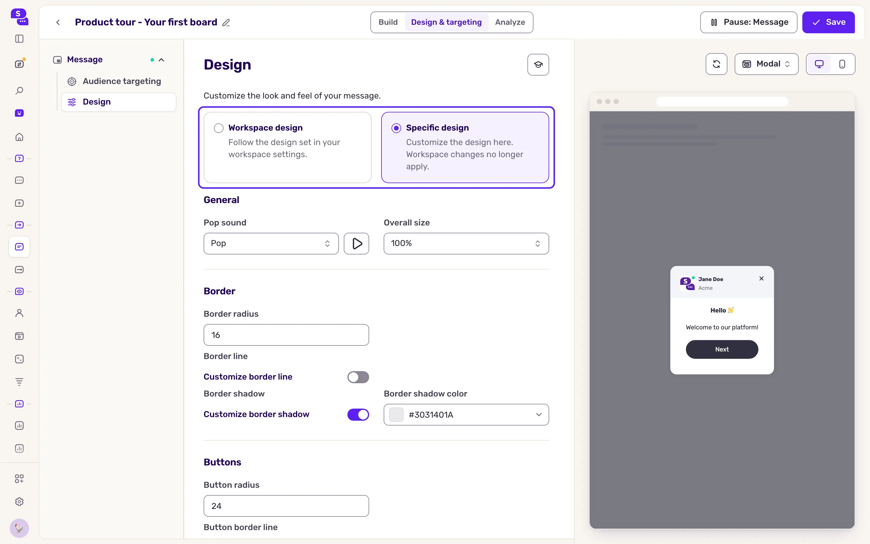
In the side menu, the Design entry now shows Custom. To go back to the default, click Workspace design.
What you get
Section titled “What you get”Every message uses the default design, so a change there applies to all of them at once. Messages with a specific design keep their own and ignore later changes to the default. Changes to a live message apply once saved.
Troubleshooting
Section titled “Troubleshooting”A field is locked with an upgrade prompt. It belongs to advanced customization, which your plan does not include.
The message does not show the change. Check its design source: with Specific design, the default design does not apply. A page already open may need a reload.
The page behind the message is not dimmed. The overlay is set per step: open the step in the editor and turn on “Show overlay”. It is on by default for a Modal, off for a Sidebar or a Banner, and “Embed in element” turns it off for a modal.
Save stays disabled. Nothing changed yet, or a value is invalid, such as a malformed color code or a font size out of range. Fix that value.